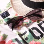
The key word of fashion wished for men aged 50’s seems to be “appropriateness for age of composer”.
The keyword that easily fits the age suitable for the year is which brand you choose.
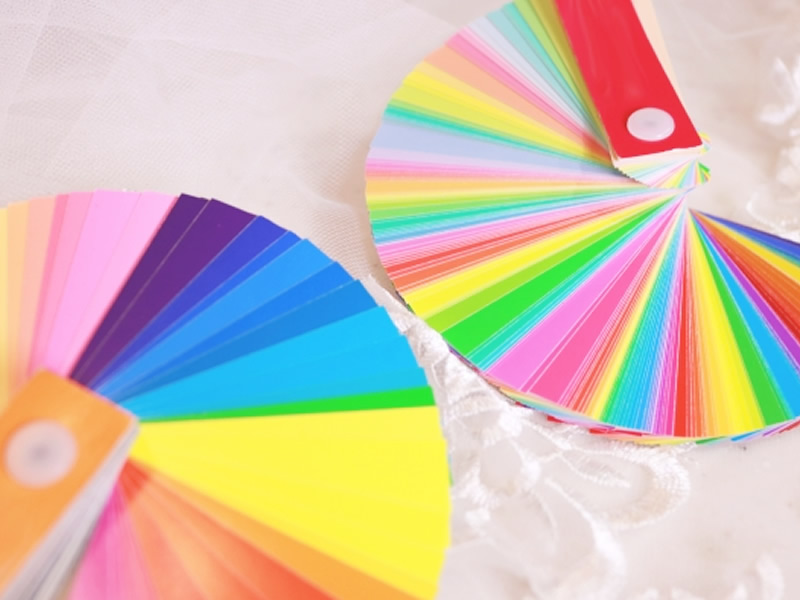
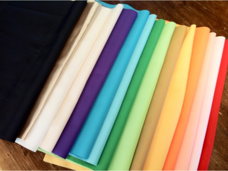
Not only brand, coloring is also an important factor to just build 50’s fashion well.
Especially as you age, it may not match the color that suits you until now. The brighter color than a darker color. Also, a concept of colors may change significantly.
Although, there are many colors. I cannot choose to see what color should fit together.
Wanted for aged 50’s, not too composure and not too much. Let’s see at the tips of such perfect color to choose.
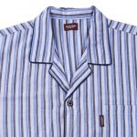
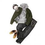
The color which becomes the base stabilizes the calm in black and white, navy, brown.
The base is the main bottom or tops.
When only wearing one type of color it can give off a heavy impression, bottom and top. It can make people think negatively. It is best to decided which is the base color.
Since the base color is basically a calm color of adults, even if you add a bright color, the whole impression will not collapse.
Calmness of adults is to make the foundation firmly first, so it is necessary to carefully examine where to put the color of the base and what color to choose.
Although I say that heavy it comes to the whole body base color, but there is pretty as a combination because the white × black, white × navy simple and elegance even in the base color.
Tips for choosing colors that match seasonal feeling
Although there is a sense of stability if you set the base to calm coloring. There was time of overflows somewhere is plain or too familiar of the Uncle or Father feeling.
So, adding the vivid color of matching with the base color and you will get more fashionable at once.
At that time, it is important to note that if you match flashy color in a blurry scene, it will be somewhat impressive.
The point of choosing color is:
Choose gentle hues and earth colors instead of primary colors
Choose a color that fits the seasons
Avoid of showy colors
What is there.
Since the impression of the face is blurred. I think whether there are many people with resistance to a gentle earth color system, but if one of black, navy, white and brown with stability is placed in the base color and with a secondary color adding contrast, the effects are clear.
When the base color would match the primary color system and the flashy color, you must be careful not to overdo it and become quite a Heavier impression.
Furthermore while choosing the colors. Choose colors fit the season, the impression from the surroundings will be UP.
Choosing the earth colors with a sense of season seems to have a high degree of difficulty, but it matches more than you think, because the base colors is easy to match with any colors.
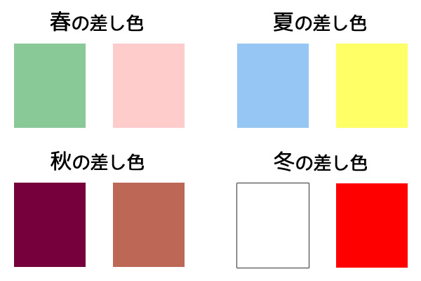
The matching colors that fits the season is below
Recommended fellow colors in spring: mint green, light pink
Recommended fellows in summer colors: Sachs blue, lemon yellow
Recommended fellows in autumn colors: Bordeaux, terracotta
Recommended fellow in winter colors: White, Red
For inquiries about matching colors and coordination, feel lightly to contact Mid International Customer Support!